Best Reporting Tools in 2026 – In-Depth Comparison

If you’re still calculating business metrics by hand, it’s time to upgrade to modern reporting tools.
Excel and Google Sheets work for daily tasks, but not for managing performance. Modern reporting tools make it easy to create interactive reports and gain real-time insights.
In this article, we review the top ten business intelligence platforms, highlight their key features and user feedback, and share tips for selecting the right solution.
What Are Reporting Tools?
Reporting tools are software solutions that support business operations by collecting, processing, and presenting data. These types of tools are used across a wide range of industries, including professional services, finances, manufacturing, and more.
Reporting tools can bring various benefits compared to manual methods or spreadsheets to gather data. This includes increased clarity, workflow efficiency, reliable data, and overall improved business performance.

Before Productive, I felt like my role was updating spreadsheets. With Productive, I’m able to focus more on actually analyzing the data than just putting numbers into spreadsheets.
Learn how you can support your service business intelligence with Productive.
A growing business will need to invest in the right kind of business tools to manage its performance. Here are two main types to consider:
Main Types of Reporting Software
According to how they process data (and how difficult they are to learn), we can distinguish between:
- Tools that are focused on agency management and project-related insights. These tools usually source data from platform activities — such as time tracking, budgeting, resource scheduling, etc. — and then allow you to filter and group this data with various metrics to turn it into insightful reports. Productive is an example of this type of tool.
- Tools that provide an advanced way to enter and process your data by using SQL queries or other types of scripting languages. These BI reporting software solutions offer extremely flexible and advanced analytics but come at the cost of a steeper learning curve and time investment. Tableau or Sisense are popular examples.
We can also distinguish some subtypes of reporting tools according to their niche, such as marketing reporting tools or digital agency CRM tools.
Try Productive’s professional services reporting
Key Features of Reporting Solutions
Despite their differences, there are a couple of features to consider when researching reporting software applications. These include:
- Visual representations, which allow companies to turn their numbers into easy-to-read visualizations (charts, graphs, etc.)
- Interactive dashboards, or the ability to set up individual boards with sets of data and share it across relevant team members
- Customizable templates that can be edited with agency-specific parameters or used as-is to simplify the creation process.
- Scheduling and automation, both to eliminate manual labor in updating your numbers, and to ensure reports are delivered to key business users on time.
- Security features, for example, customizable user permissions to help control who can see and do what with your data.
There are some other advanced features to consider, but more on that as we explore specific BI tools.
List of the Top 10 Reporting Platforms
Here’s a quick summary of our picks for the top 10 reporting platforms and BI tools and what they’re best suited for:
1. Productive – The Best Platform for Service Business Intelligence
Productive is an all-in-one management software tailored specifically for professional services automation and agency workflows. Productive supports agencies by combining several key features into a single platform:
- project and task management
- time tracking
- resourcing planning
- budgeting and invoicing
- sales performance management
However, reporting is one of Productive’s standout features. It pulls from various platform data sources to deliver custom reports and powerful forecasting capabilities, helping professionals make data-driven decisions.

One way to get a pulse on the business is to get the monthly financials, but for the monthly financials to come in, it takes the accounting department about 15 days after the month ends before we get a picture of how we really did that month. Whereas, with the financial tools that Productive offers, you can check it on a daily basis. We have clear visibility at any given time.”
Best of all, it doesn’t require advanced technical expertise. Let’s explore Productive’s reporting in more detail:
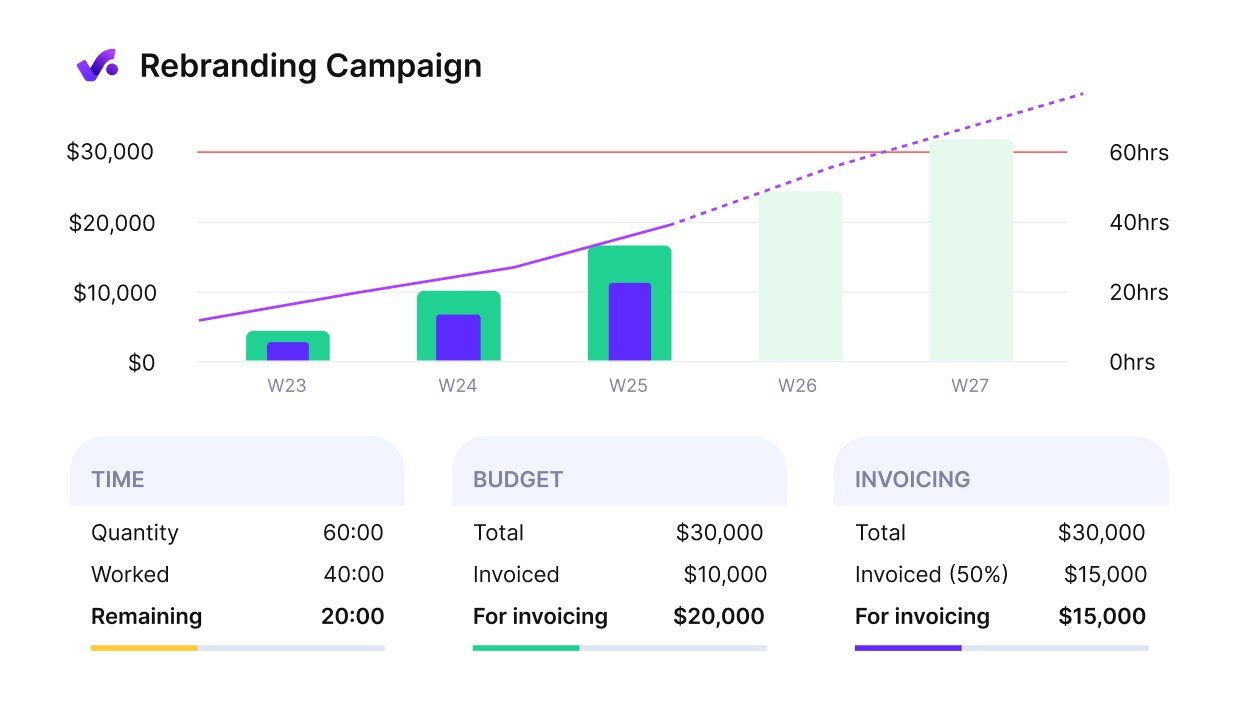
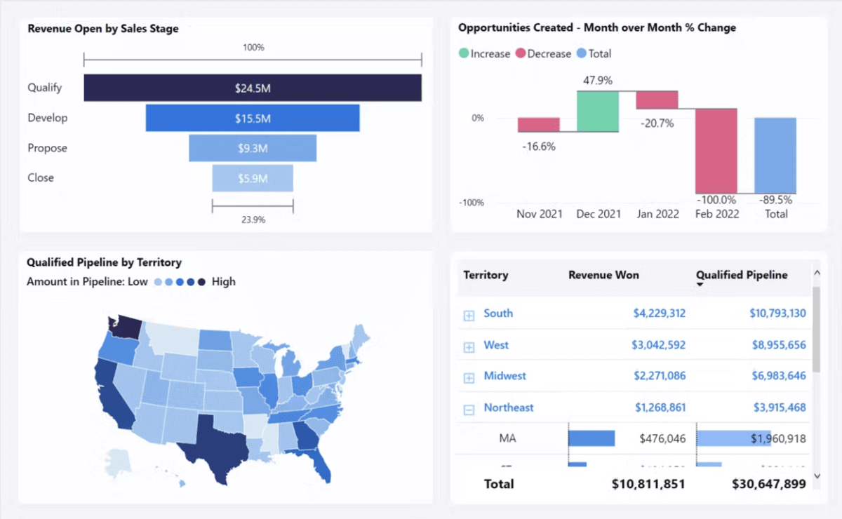
Reporting
Productive’s Reporting delivers in-depth data on various platform activities, including your project progress, time tracking, finances and payments, people, sales, and more.
To create your report, you can use one of the 50+ agency-focused templates from the Reports Library, or create your own from scratch.
Reports can look like a data table, a visualization (column, line, area, metric, etc.), or both, depending on your preference.

Sort, filter, and visualize your data with Productive
Reports can be customized with various filters — you can also add agency-specific parameters with custom fields. Data can also be grouped and pivoted by different metrics to provide a 360-degree view of business performance.
You can also:
- Export your report in PDF format
- Save your reports and categorize them for easier later access
- Create custom dashboards and add reports as widgets, and then share them across specific users
- Set up automatic report sending to email or Slack with Productive’s Pulse system
- Let AI do it for you: Describe what you need in your own words, and AI will generate your report
If you’re a data whiz, you can also check out Polaris, Productive’s SQL-based tool for creating fully flexible reports.
Try Productive’s professional services reporting
Forecasting
Productive is the best tool if you’re looking for comprehensive service business intelligence: this also includes financial forecasting. For example, if you schedule your employees in the Resource Planning module, you can get access to your current and forecasted revenue, budget burn, and profit margins.
If you add or remove employees from projects, these metrics will be updated in real time. This gives you the ability to stay one step ahead of projects and have full transparency with your clients. Check out some more capacity reports you can create in Productive.
FORECAST key agency and capacity planning metrics
Additional Features
You can also use Productive for project budgeting and financial management — build and monitor your budgets, handle invoicing (either in the platform or with native Xero and QuickBooks integrations), and revenue recognition.
This is combined with project management and collaboration features, so you can get both high-level company and granular project insights. Capabilities include various project views (such as Gantt or Kanban), customizable notifications, time tracking and time off management, and much more.
Other useful features include:
- Permissions Builder: Control who can see and do what across the platform with a flexible permissions system.
- Automations: Build no-code automation sequences to streamline repetitive tasks and workflows.
- Productive AI: Currently available as part of Productive Docs, the artificial intelligence feature helps you create better documentation.
- CRM: A lightweight CRM system for managing sales team performance — build and send proposals, customize your sales funnel, track revenue and profitability, and more.
Integrations
Productive has a solid range of integrations for a variety of business needs. For accounting, this includes Xero and QuickBooks; for collaboration and productivity, Slack and Google Calendar; for HR management, Breathe and BambooHR; and HubSpot for syncing deals.
Pricing
- Plans start with the Essential plan at $10 per user per month, which includes essential features such as budgeting, project & task management, docs, time tracking, expense management, reporting, and time off management.
- The Professional plan includes custom fields, recurring budgets, advanced reports, billable time approvals, and much more for $25 per user per month.
- The Ultimate plan has everything that the Essential plan and Professional plan offer, along with the HubSpot integration, advanced forecasting, advanced custom fields, overhead calculations, and more. Book a demo or reach out to our team for the monthly price per user.
Productive offers a 14-day free trial, so you can check what the software can do for your organization.
Create In-Depth Reports in Productive
Use Productive’s library of 50+ agency templates or create your report from scratch for informed decision-making.

2. Celoxis – Best for Enterprise Portfolio Reporting & Resource Insights
Celoxis is an enterprise-grade reporting tool that blends project and portfolio management with powerful business intelligence dashboards. It’s built for organizations that need advanced visibility into project performance, financials, and resource utilization; all in one centralized platform.
The software goes beyond traditional project tracking by combining robust project planning with interactive reporting and BI-quality visualizations, making it a strong alternative to standalone analytics tools.
Key features include:
- Real-time, interactive reporting tools for projects, portfolios, and resources
- Custom report builder with formulas, grouping, and scheduling options
- Built-in financial tracking for budgets, billing, and profitability
- What-if scenario planning for capacity and revenue forecasting
- AI-powered Lex assistant for automating reports and predictive insights
SOurce: celoxis
User reviews often highlight Celoxis’s unified ecosystem, which brings together reporting, analytics, and execution under one roof. Teams appreciate how seamlessly it connects project data with financial insights, making it easier to track profitability and performance without relying on multiple BI integrations.
Users find Celoxis brings planning, execution, and reporting tools together in one platform. Dashboards and BI-quality reports make it easy to track project health, profitability, and share insights with stakeholders.
Source: Paraphrased from G2 and Celoxis official site
While some users mention a slight learning curve due to its enterprise-level depth, most agree the experience quickly becomes intuitive with use. Once teams settle in, Celoxis transforms into a central command hub for monitoring project health, reporting, resource utilization, and profitability in real time.
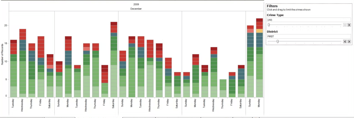
3. Zoho Analytics – A Good Visual Analytics Tool
Zoho Analytics is a business intelligence reporting tool that supports SQL queries for your database. It’s designed to support sales, marketing, finance, project management teams, and more.
The tool offers a cloud-based and on-premise installation; both billed on a subscription model.
Key features include:
- Data integration with multiple sources, including business apps, databases, etc.
- Self-service data preparation module to streamline preparing and cataloging data
- AI assistant for generating automated insights and supporting analysis
- Interactive reports and customizable dashboards with a drag-and-drop interface
- Secure sharing and user permissions
SOurce: zoho analytics
User reviews state that they enjoy using Zoho Analytics as an integrated application for sales, marketing, support, HR, accounting, and other business operations. Other users state that it’s fairly user-friendly for an out-of-the-box analytics solution.
For its main issues, multiple users note that integrating data from different sources can be clunky and difficult, as you must ensure you have the proper data structure. Additionally, multiple users state that Zoho could provide more comprehensive learning materials to bridge the steep learning curve.
There’s still an initial learning curve to get the platform running, and help documentation is not always as easy to follow. Support is helpful, but there is often a language barrier.
Source: Paraphrased from G2
4. Sisense – A Flexible BI Tool
Sisense is a business intelligence platform for various industries, including healthcare, retail, manufacturing, financial services, and tech.
It offers two main ways to manage your data: Fusion Embed, an AI-driven, low/no code, embedded analytics application; and Compose SDK, a developer toolkit that lets users create flexible queries, charts, and filters with code.
Key features:
- AI capabilities for forecasting, business trends, and natural language queries
- Git integration for versioning and collaborative work on analytics
- Live connections with data warehouses, Sisense’s proprietary
- ElastiCube technology, or hybrid options
- Options for cloud, on-premise, and hybrid installation
Source: sisense
Some of the upsides that users mention for Sisense include the ability to build backend models, which can then be used by end users without advanced tech knowledge to create self-service dashboards, and the quick processing of large quantities of data.
You could comfortably build dashboards on 100M records tables in Sisense. Anything we build in Tableau starts choking at 2m+. This means you’re constantly aggregating everything to such a high level that it’s often not detailed enough.
Source: Reddit
However, there are also plenty of downsides. Certain users find the interface unintuitive, especially after using comparable tools like Tableau and Microsoft Power BI. Regarding their touted proprietary ElastiCube technology, reviews state that they can be expensive to maintain and keep at a decent refresh rate. Finally, the learning curve is steeper due to a smaller community base and a lack of official documentation.
5. Tableau – A Good Tool for Actionable Insights
Tableau is another popular analytics platform for creating custom reports on interactive dashboards. It uses a proprietary language called VizQL, described as a “visual query language for databases”.
It works like a translator for SQL queries: when a user drags and drops data around a Tableau interface, these numbers are automatically translated into visuals.
Key features:
- AI-powered analytics, including natural language queries and KPI tracking with Tableau Pulse
- Self-service data preparation with Tableau Prep Builder
- Data connectivity with files, data warehouses, or third-party applications
- Native integration with Salesforce for marketing and sales teams
source: tableau
Users report that Tableau might not be the best for complex data exploration for data scientists and related experts. However, it’s a great tool in a business environment, as it makes valuable insights more accessible and easier to understand to non-tech users.
As one of the main downsides, G2 users report that it’s among the more expensive data management and visualization tools on the market, which can make it inaccessible to small to medium-sized organizations.
Additionally, there has been some friction since Salesforce acquired Tableau:
I first started using Tableau about 12 years ago. The support side of things is night and day from then till now. I had already noticed a shift before Salesforce, but that really accelerated the decline.
Source: Reddit
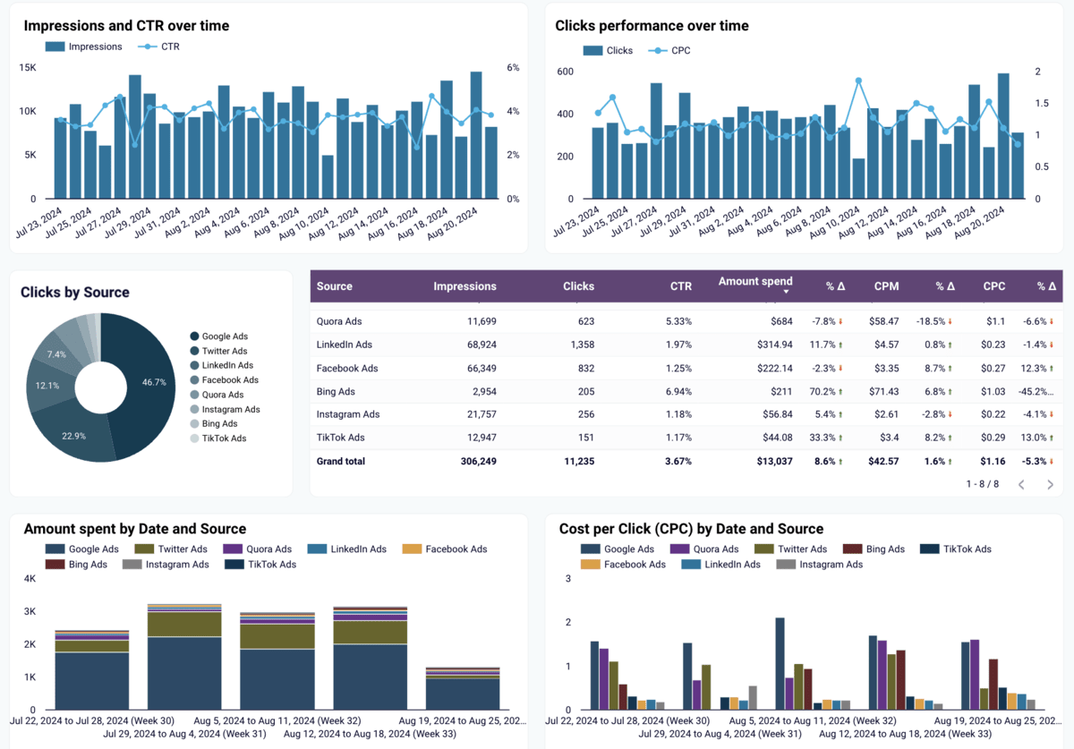
6. Improvado – A Strong Option for Enterprise Marketing Reporting
Improvado is a marketing analytics and intelligence platform designed to help enterprises and agencies centralize their marketing data. It focuses on automating data extraction, transformation, and delivery so teams can analyze performance across multiple channels without relying on manual exports or spreadsheet-based reporting.
Key features:
- 500+ marketing and sales data source integrations
- Automated data extraction and normalization
- Delivery to BI tools and data warehouses
- AI-powered insights and performance monitoring
- Enterprise-grade security and governance
source: improvado
User reviews highlight Improvado’s ability to consolidate marketing data into a single reporting environment, making it easier to manage cross-channel analytics. Teams often appreciate the platform’s wide integration library and automation capabilities.
On the downside, some users mention that advanced implementations may require technical involvement, and customization can take time depending on reporting complexity.
Overall, Improvado is best suited for larger organizations that need a dedicated marketing data pipeline rather than a lightweight visualization tool.
7. Google Analytics – A Popular Marketing Reports Tool
Google Analytics is essential for helping marketing teams make informed decisions based on reliable data on key performance indicators.
There are two versions of the tool: Google Analytics 4 or GA4, a free version of the tool that covers essential web-based data. The priced version is called Google Analytics 360, and it’s best suited for enterprises and companies looking for advanced data and unlimited export to BigQuery.
Key features:
- Customer-centric insights across sites and apps
- Various report types, including acquisition, monetization, engagement reports, and more
- Predictive analytics with Google’s machine learning
- Integrations across Google’s advertising and publishing tools (Google Ads, Google Search Console, etc.)
source: google analytics
Users usually don’t find much to fault with Google Analytics 4. As a free product with an easy implementation process, it can do a lot for web-based business intelligence. Perhaps the biggest downside is that data may not be fully accurate at times, which is something you’ll need to work around:
In some cases, Google Analytics uses sample data, especially for high-traffic websites or complex queries. This means that the reported metrics may not always be fully accurate, particularly for detailed analysis.
Source: G2
We also have a list of the top digital marketing agency software, so check that out to learn more.
8. Coupler.io – All-in-One Analytics and Reporting
Coupler.io is a powerful data analytics and reporting tool. It simplifies the process of data collection, transformation, and visualization, which makes it ideal for various reporting needs, including sales, marketing, finance, and even white label reporting.
Key features:
- Connect 60+ data sources like Google Analytics, Salesforce, and HubSpot
- Visualize data effortlessly in Google Sheets, Looker Studio, Power BI, and more
- Automate data refresh with schedules ranging from 15 minutes to one month
- Use ready-made report templates or customize your own for detailed insights
SOURCE: COUPLER.io
Users appreciate Coupler.io for providing a clear, organized view of business metrics without requiring technical skills. The tool also stands out for its ability to integrate with popular BI tools and streamline reporting processes. However, some users note that customization options are limited for those who need to work with less common data sources and destinations.
9. Microsoft Power BI – A Popular Solution for Advanced Data
Microsoft Power BI is a business intelligence platform that’s sometimes described as “super Excel” — though there’s a lot more to it. One of its best features is its integration with other tools in the Microsoft ecosystem, such as Excel and PowerPoint.
Key features:
- Uses DAX, a library of functions and operators, to build formulas and expressions
- Power Query is used to connect to data sources and transform them
- Excel integration with automated refresh, visualizations, and advanced analytics
- Reporting templates and AI support for a simpler first-time experience
source: Microsoft Power BI
Power BI has been gaining popularity in the past couple of years. Users typically enjoy it because of its integration with other apps in the Microsoft ecosystem, continuous improvements, and affordability.
The biggest downside of PowerBI is the fact that it doesn’t use SQL; instead, DAX is used for data modeling and creating calculated columns and measures, which is a new skill that will take time and effort to learn. Additionally, a user states that Tableau can be better for sharing reports:
I do enjoy how easy it is to share reports with Tableau, powerBI hates when you want to communicate with people outside of your AD.
Source: Reddit
10. HubSpot – A Solid Marketing Reporting Tool
HubSpot is a leading provider of software solutions for marketing, sales, and customer support teams. It’s not purely a reporting tool, but offers a wide variety of solutions for marketing project management.
Key features:
- Campaign performance tracking and web tracking analytics
- Customer journey analytics and attribution reporting
- Detailed marketing reports and customizable dashboards
- Email marketing, forms, and ad campaign management
source: hubspot
HubSpot is one of the staple tools for understanding various marketing channels, as it integrates SEO research, Google Analytics, CMS, content management, and email marketing in one platform.
However, certain users state that its reporting feature can be a weak point:
It doesn’t use the typical dimensions / metrics approach that every other report suite does. It relies on screen flows and wizard features that make it really hard for experienced users.
Source: Reddit
For more comprehensive reporting, you can use connectors to link HubSpot with more advanced analytics software, such as Google Data Studio, Tableau, or Power BI, which can do the trick for users.
11. ClickUp – A Good Option for Basic Project Reports
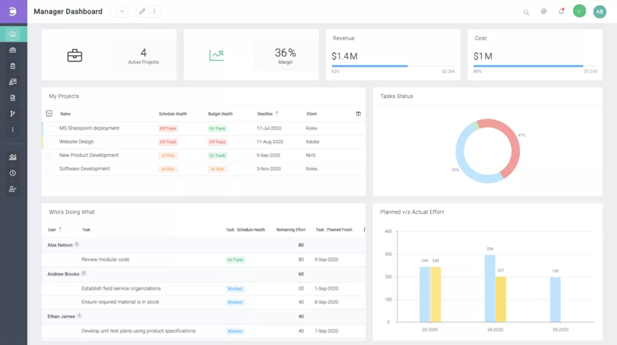
ClickUp is a project management platform for companies of all shapes and sizes. Like Productive or HubSpot, it’s not a specialized reporting tool but offers some features for managing analytics, including:
- Report types such as task completed, tracked vs estimated time, or agile reporting
- Building custom dashboards with widgets
- Workload view for visualizing employee availability and resource scheduling
- Project management and collaboration features, including multiple project views and documentation
source: clickup
ClickUp is commonly used for basic project and task management, as it offers a good amount of flexibility to monitor and guide productivity across various businesses and teams.
However, while ClickUp does offer insights into project management and team availability, it doesn’t have integrated budgeting and invoicing features. This makes it a good option for managing project progress and tasks but less than ideal for all-in-one agency management.
If you’re looking for the best project management tool with reporting features, we have a comprehensive guide you can check out here: Trello vs Asana vs Monday vs ClickUp.
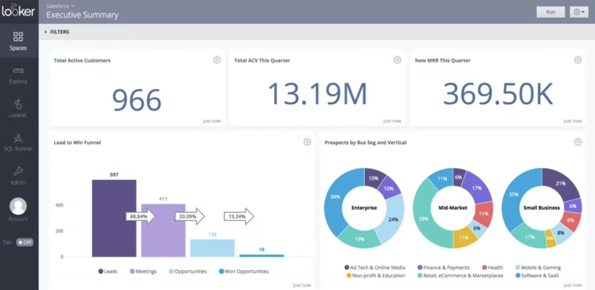
12. Looker Studio – An Affordable Self-Service Option
Looker Studio, formerly known as Google Data Studio, is predominantly a marketing reporting tool. It offers a free version as a self-service business intelligence platform.
The paid version, Looker Studio Pro, offers an affordable per-user subscription rate, with the added benefit of Google Cloud support and system administration.
Key features:
- Engaging charts, graphs, and other data visualizations
- A wide range of data sources for centralizing and unifying data
- Library of reporting templates with an editor for drag-and-dropping objects
- Report embedding for sharing your reports across the web or intranet
source: Looker Studio
Users describe Looker Studio as a simple tool for essential reporting needs. It’s a great option for smaller businesses that want to create quick data visualizations.
Keep in mind that Looker Studio and Looker are two different tools (though both belong to the Google ecosystem). Looker Studio is described as a tool that provides ad-hoc reports and dashboards and is free, fast, and simple to use. On the other hand, Looker offers more advanced enterprise dashboards for in-depth data analysis.
How to Choose Your Report Management Software
We’ve covered a wide variety of reporting software solutions. To provide a short summary, you can find great options here for your marketing analytics, such as GA4 or Looker Studio.
If you want to analyze complex datasets, consider options like Tableau, Microsoft BI, or Sisense.
But if you want a tool that combines agency management features with advanced reporting tools, Productive is your best pick. Optimize your resourcing, budgeting, analytics, project and task management, and so much more, all in a single platform.
Book a demo for Productive today.
