6 Project Dashboard Examples for Professional Services Teams

A project dashboard should make client work easier to track, not add another layer of numbers to decode. Add too many widgets, and it’s easy to drown in metrics while still missing the bigger picture. That’s why we’ve put these examples together: to help you find the view that cuts through the numbers and shows what needs attention.
Below, you’ll find practical project dashboard examples for professional services teams, plus a simple table that helps you choose the right one for the problem you’re trying to solve. We’ll also walk through a step-by-step process for building a dashboard that keeps key data visible and helps your team make faster calls.
Key Takeaways
- Dashboards are easier to use when each one has a clear role: use separate views for tasks, utilization, budgeting, sales, invoicing, and finance instead of forcing every metric into one dashboard.
- Choosing the right dashboard depends on the problem you want to solve: start with the one that explains what is going wrong, whether that is overdue work, unclear capacity, unpaid invoices, or weak margins.
- Creating a dashboard follows a clear process: define the dashboard type, add widgets that match the dashboard, and set permissions by role.
- A dashboard is most effective when the data behind it comes from a single source: tasks, time, budgets, invoices, and profitability are easier to track when teams are not stitching inputs from different tools.
What Are Practical Dashboard Examples for Professional Services Teams?
Practical dashboard examples for professional services teams include the tasks dashboard, utilization dashboard, budgeting dashboard, sales dashboard, invoicing dashboard, and finance dashboard.
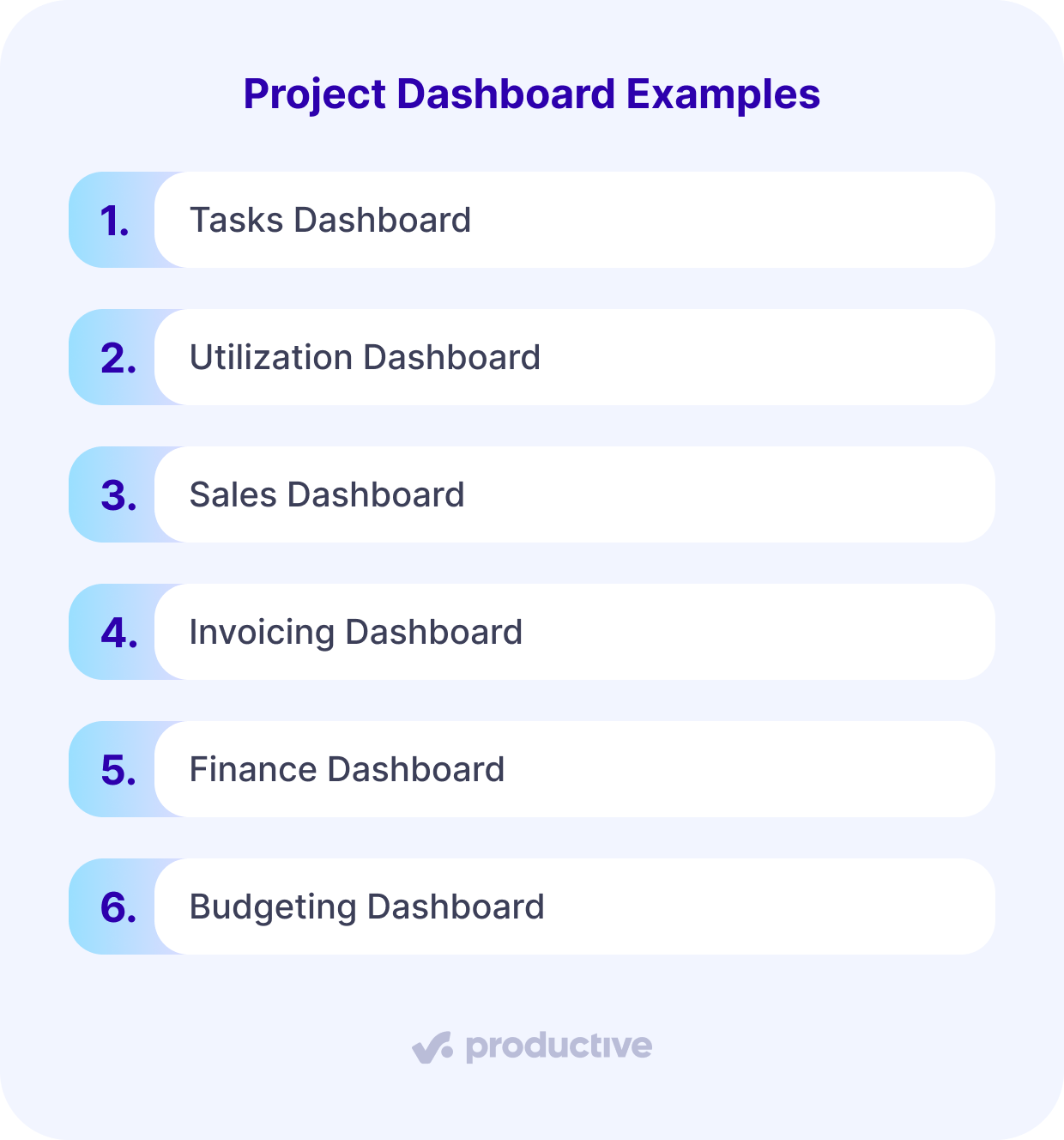
We’ll look at each one in more detail and explain what it helps you track, which metrics to watch, and why it matters for client work.
1. Tasks Dashboard
A tasks dashboard helps teams see whether delivery work is moving, stuck, overdue, or missing ownership.
| Best for | Metrics to watch | What it helps you decide |
|---|---|---|
| Tracking delivery work across active projects | Overdue tasks, tasks without due dates, open tasks by assignee, task status, time variance | Whether work needs reassignment, escalation, or clearer ownership |
Project delays usually start quietly. A task has no due date, ownership is unclear, or a deadline slips by a few days. PMI’s 2025 project success research found that nearly 45% of projects that ultimately succeeded were still perceived as at risk at some point, underscoring the importance of early task signals.
A tasks dashboard gives managers one place to check overdue tasks, open work by assignee, recently resolved work, and task data. If project progress slows down, they can see whether work is blocked, spread unevenly across the team, or missing basic details like dates and owners.
Instead of waiting for a project status report or chasing status reports across Slack, email, and meeting notes, teams can use the dashboard to decide who needs help, what needs reassignment, and which project status issues need attention.
For more on tracking progress, risks, and status across active work, see our guide to project monitoring.
2. Utilization Dashboard
A utilization dashboard helps teams see whether people have the capacity to deliver the work already scheduled for the project.
| Best for | Metrics to watch | What it helps you decide |
|---|---|---|
| Understanding resource capacity and team workload | Scheduled vs worked hours, available vs scheduled hours, missing time, approved time off, forecasted billable utilization | Whether the team is overbooked, underused, or at risk of missing delivery dates |
Project status is not complete without capacity. A project can look calm on the task board while the person responsible for the next milestone is already booked past what any human should pretend is fine.
A utilization dashboard gives project managers a clearer view of team workload before deadlines start moving. Use it to compare scheduled vs worked hours, available vs scheduled hours, missing time entries, approved time off, and forecasted billable utilization.
Many teams still manage resource capacity in Float, spreadsheets, or separate resource management tools. That split creates resource conflicts that only become apparent as the schedule slips.
Productive’s Resource Planner connects directly to project work, so teams can see bookings, resource allocation, availability, and absences without rebuilding a separate spreadsheet.
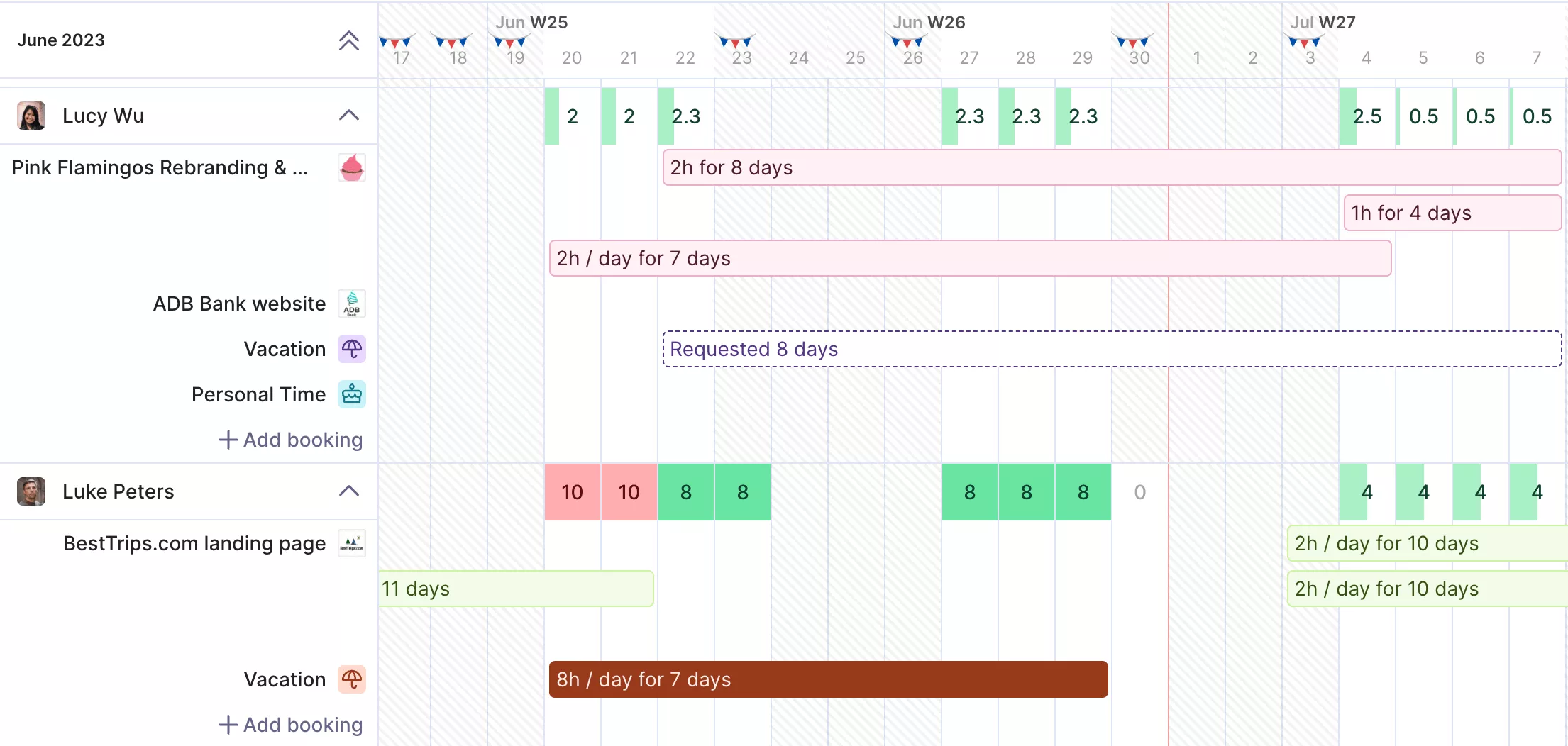
SPOT RESOURCE GAPS BEFORE DELIVERY SLIPS.
Balance resources in Productive.
3. Sales Dashboard
A sales dashboard helps professional services teams see how future work may affect revenue, capacity, and the project schedule.
| Best for | Metrics to watch | What it helps you decide |
|---|---|---|
| Connecting pipeline visibility to future delivery needs | Active deals, deal stages, deal owners, recently added deals, projected sales revenue | Whether upcoming work may affect hiring, scheduling, or resource planning |
For professional services teams, the pipeline is more than a revenue forecast. Every new deal can affect team workload, hiring plans, and delivery timelines.
A sales dashboard helps owners and project managers connect future demand with the work already planned. Instead of treating the pipeline as something the delivery team hears about later, it gives them a cleaner view of what may need people, time, and budget next.
This matters when teams manage several project portfolios at once. CRM systems can show what is coming, but the project team still needs to understand what that work will demand. When pipeline movement is connected to portfolio performance, capacity planning gets a little less “let’s hope this works.”
This is especially important when teams need to manage multiple projects across clients, services, and shifting timelines.
4. Invoicing Dashboard
An invoicing dashboard helps teams see whether completed work has been billed and whether revenue has been collected.
| Best for | Metrics to watch | What it helps you decide |
|---|---|---|
| Tracking billing and collection risk | Open budgets to invoice, unpaid invoice amount, overdue invoices, invoiced revenue, invoices not exported to accounting | Whether delivered work is stuck before billing, payment, or accounting handoff |
Project health does not stop when the last task is checked off. For professional services owners, delivered work still has to be invoiced, paid, and eventually become team revenue. Otherwise, the project may look finished while the business side is still waiting for the money to catch up.
An invoicing dashboard helps close that gap. It can show open budgets to invoice, unpaid invoice amount, overdue invoices, invoiced revenue, invoiced cost and profit, invoices not exported to accounting, and overdue invoices by client.
This kind of dashboard reporting is useful because it connects data to the financial follow-through of client work. It also gives teams cleaner control around what has been delivered, what has been billed, and what still needs attention.
5. Finance Dashboard
A finance dashboard helps owners see whether client work is profitable, not just busy.
| Best for | Metrics to watch | What it helps you decide |
|---|---|---|
| Spotting profitability and financial risk | Revenue, cost, profit, margin, profitability by client, lowest-profit budgets | Whether a project, client, or service line needs attention before margin slips further |
Task progress can hide margin problems. A project may look healthy while senior people cover junior work, extra rounds pile up, and budget burn moves in the wrong direction.
A finance dashboard gives owners a cleaner view of revenue, cost, profit, margin, profitability by client, and the lowest-profit budgets. It works like a profitability dashboard for the financial side of project performance, where task status cannot help.
This matters because budget tracking often appears too late. If teams only see the issue after a report, a time tracker check, or a month-end review, project controls become about explaining what happened rather than preventing it.
6. Budgeting Dashboard
A budgeting dashboard helps teams see whether sold work has been planned, scheduled, and allocated before delivery starts to drift.
| Best for | Metrics to watch | What it helps you decide |
|---|---|---|
| Spotting profitability and financial risk | Open budgets, services with time left to schedule, remaining hours to allocate, scheduled vs worked hours | Whether the budget has enough planned capacity to deliver the work promised |
Budget management gets tricky after a deal becomes real work. The scope is approved, but the team still needs to turn that budget into hours, services, owners, and a project timeline. A budgeting dashboard shows open budgets by client, services with time left to schedule, remaining hours to allocate, and scheduled vs worked hours.
Use the dashboard to keep project controls practical. If hours remain unallocated or the project timeline changes without an updated budget plan, the team can spot the gap before delivery turns into guesswork.
For a closer project-level view, a budget chart can show how time, budget, and invoicing are tracking on a specific project.
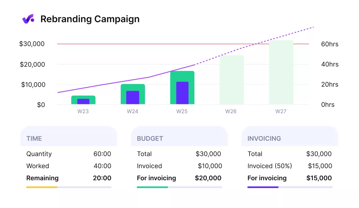
TRACK TIME, BUDGET, AND INVOICING IN ONE PROJECT VIEW.
If you’re comparing budgeting software, check out our list of business budgeting software.
With the main dashboard examples covered, the next step is choosing the one that explains the issue at hand.
How Do You Choose the Right Project Management Dashboard?
You choose the right project management dashboard by matching the dashboard to the problem you need to understand first.
The examples above show what each dashboard does. The table below gives you a faster way to choose where to start.
Dashboard Selection Table
| If this is the problem | Start with this dashboard | Check these metrics first |
|---|---|---|
| Work is slipping and ownership is unclear | Tasks Dashboard | Overdue tasks, tasks without due dates, open tasks by assignee |
| Capacity is hard to judge | Utilization Dashboard | Available vs scheduled hours, missing time, forecasted utilization |
| Sold work is not fully planned | Budgeting Dashboard | Open budgets, remaining hours to allocate, scheduled vs worked hours |
| Future work may overload the team | Sales Dashboard | Active deals, deal stages, projected revenue |
| Completed work is not turning into cash | Invoicing Dashboard | Open budgets to invoice, unpaid amount, overdue invoices |
| Projects look busy but profit is unclear | Finance Dashboard | Revenue, cost, profit, margin, lowest-profit budgets |
Start with the dashboard that matches the issue you’re facing. A project tracking dashboard helps when delivery is messy, but it will not explain weak margins or capacity pressure. Dashboards work best when each view has a clear job, each set of project metrics supports that job, and project managers can read the data without needing another meeting to decode it.
Once that starting point is clear, building the dashboard becomes much easier and much less likely to turn into a wall of charts nobody wants to open.
How Do You Create a Project Dashboard?
Create a project dashboard by defining the dashboard type, adding widgets that match that dashboard, and setting permissions so the right people see the right data.
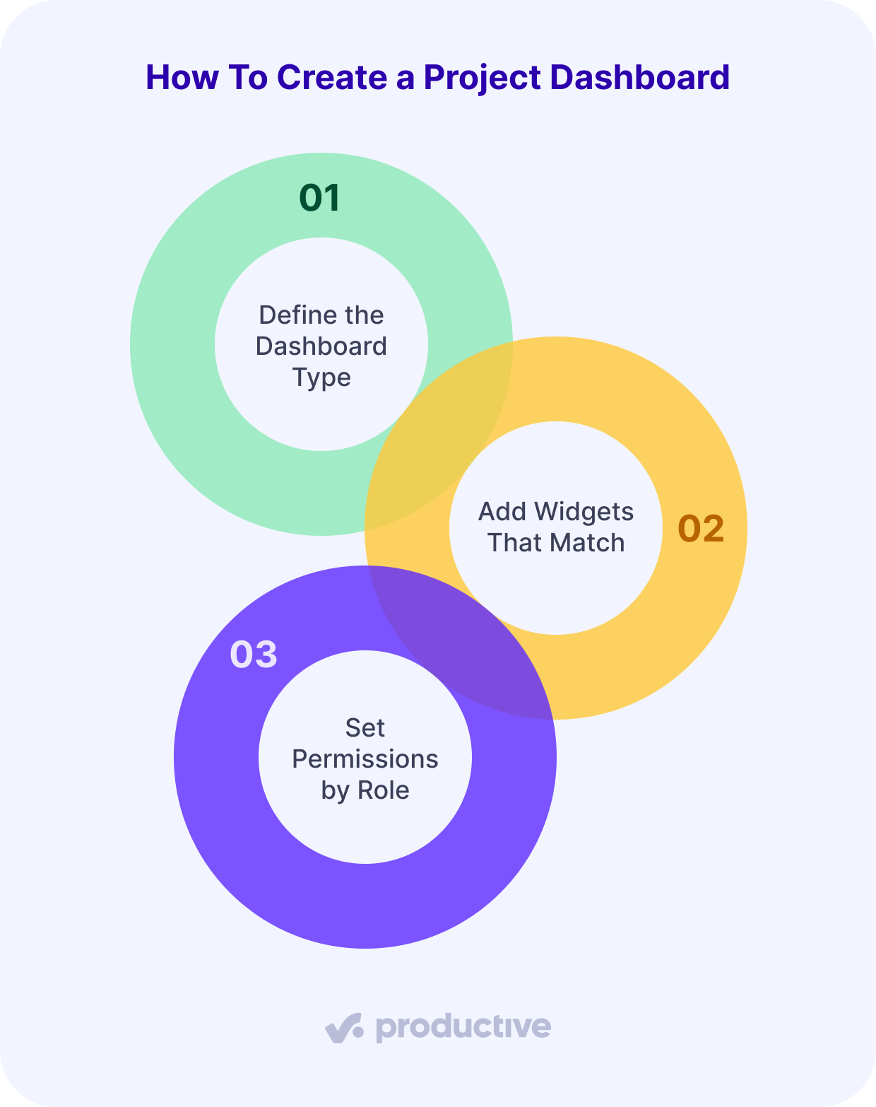
We’ll look at each step in more detail below.
Step 1: Define the Dashboard Type
A useful dashboard starts with the type of view you need, not a long list of dashboard widgets.
Teams often build dashboards backward. They add every chart, table, and dashboard feature they can find, then wonder why nobody opens the thing unless a meeting invite forces them to. A good dashboard starts with a practical choice: what kind of dashboard will answer the need fastest?
That dashboard type can be based on a specific question:
- Is delivery slipping?
- Is the team overbooked?
- Is the project profitable?
- Is budget burn under control?
- Is the work ready to be invoiced?
Once the dashboard type is clear, choosing the project metrics becomes easier. You are no longer building a dashboard because the software lets you do so. You are building it because someone needs a faster way to act.
Step 2: Add Widgets That Match the Dashboard
Once the dashboard type is clear, add only the widgets that support that dashboard.
A good dashboard is not a gallery of every chart your dashboard software can make. The best project dashboard software helps you combine the few signals that answer the question in front of you: useful widgets, a clear chart or table, and enough context to explain what changed.
The widgets you choose should pull the right data into a working view, not just decorate the page.

I also like that I can build dashboards, reports, and pulses that keep all the essential data at my fingertips. Before Productive, I think I spent around a day every month putting together timesheets and utilization reports.
Read the full customer story to see how Reading Room keeps essential data in one place with Productive.
Step 3: Set Permissions by Role
A dashboard works best when each role sees the project data it needs to act.
Not everyone needs the same view:
- Project managers need task status, workload, blockers, and budget signals.
- Finance leads need revenue, cost, invoices, and margin.
- Owners need project controls, client profitability, resource allocation, resource management risks, and revenue exposure.
- Team members need tasks, deadlines, priorities, and enough context to do the work.
Giving everyone the same dashboard can feel transparent, but it often creates noise. Set permissions based on how people actually use the dashboard, not on a perfect org chart that doesn’t match the work.
Use Dashboards Where All of Your Work Already Lives
Dashboards work best when they stay close to the work, time, budgets, and financial data your team already uses.
That is the real limit of disconnected dashboard software. The dashboard may look polished, but if project data still lives across task boards, time trackers, spreadsheets, and finance tools, someone has to stitch the story together.
Productive keeps projects, tasks, time, budgets, resource planning, sales, finance, and invoicing in one platform. Teams can use customizable dashboards, project-level dashboard tabs, real-time dashboards, and a project dashboard template to see what is moving, what is at risk, and what needs attention.
If you want to bring delivery, capacity, budgets, and profitability into one place, book a demo with Productive to see how it could work for your team.
FAQ
What Is a Dashboard?
A dashboard is a visual view of project status, project progress, workload, budget, and risk.
For professional services teams, a good dashboard should also show project health: whether the work is properly staffed, financially healthy, and moving toward the expected result. Dashboards can be simple or detailed, but the best ones answer a real operational question.
What Should a Dashboard Include?
A dashboard should include the metrics needed to understand project status, resource capacity, budget tracking, project performance, and billing.
Useful dashboard components typically include task status, utilization, financial performance, invoicing status, and notes explaining why a number changed. Useful dashboard features are not the flashiest ones. They are the ones that make project health easier to read and turn project metrics into a clear next step.
What Are Common Dashboard Mistakes?
Common dashboard mistakes include tracking too many metrics, using stale project data, and separating delivery progress from budget or capacity signals.
Other mistakes to avoid include:
- Adding widgets without knowing what question they answer
- Treating invoicing as separate from project health
- Relying on reporting tools without clear metric definitions or ownership
- Making data visualization look polished without making the next action clear
Good dashboard reporting should help the team see what needs attention, who owns it, and what should happen next.
Who Uses Dashboards?
Dashboards are used by project managers, owners, operations leads, finance teams, resource managers, and leadership teams.
They can support different types of work, from IT and construction projects to product development and client project portfolios. For professional services teams, practical dashboards connect delivery, capacity, budget, and revenue, enabling teams to understand project health and portfolio performance without chasing updates.
Keep Projects, Budgets, and Capacity in One Place
Productive gives professional services teams a connected view of work, time, resources, budgets, and profitability, without stitching data across separate tools.
